
Product Improvement Ideas for Cult.fit: Part-2/2
Product Improvement Ideas for Cult.fit: Part-2/2
UI/UX suggestions to make user's experience with Cult.fit more delightful.

In case if you haven’t yet- please read Part 1 of this article for ideas around new features & tweaks in the user journey to improve Cult user activation, engagement, & retention.
This part covers UI/UX suggestions for major problems in various sections of the app. I’ll get right to it.
For better image clarity and easier hyperlink use, I recommend reading this on a laptop or desktop.
Note:- I've also overlooked the issues for which enhancements have already been deployed in the mobile app but not yet on the website.
📱 A. Home screen
Problem→
A lot of options listed with no logical sequence
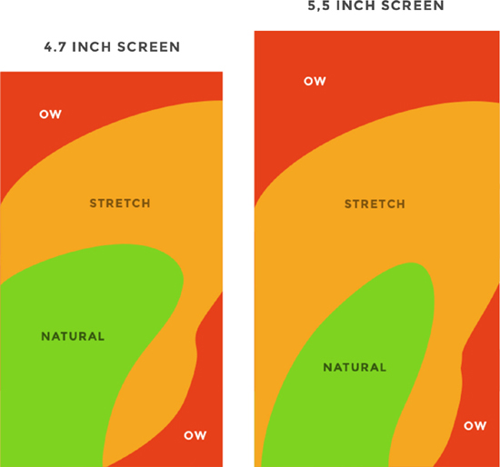
The bar at the top is tough to use the way people hold phones, especially if they are using phone with one hand. Relevant links→ 1. Phone usage style 2. Thumb heatmap pattern. 3. Images for Reference. (Assuming that a large % of users in the target group have phones with a screen size of over 5.5inch.)
Potential solution→

Success metric→ Time spent on the home screen (looking for the relevant vertical) should decrease.
📺 B. Pre-recorded workouts
Wishlist— with so many new formats & videos available on the app, I'd like to be able to save some of them for later, vs having to start from scratch every time I want to do a (pre-recorded) workout
Say I found "Learn to handstand push-ups" under "New collections" on the App, and plan to start it next month, but I can't add that into my wishlist and will have to look for it later again, and by then it'll most likely be under a different category in the app.
Mark completed workouts with a checkmark- (Refer to the screenshots below) There are 14 sessions, and I have no idea which sessions I've finished and which ones I haven't.
Up next is session #2. If I didn't go for the 2nd one yet- among the 8 that I did, it's very likely that it's because I don't want to, do it'd be better to show the next video to the last or most recent one that I watched in that album.

List of Liked Videos:- I might want to repeat some sessions, so being able to "like" the video and have a list of "liked videos" would be very helpful.
Comparing between different sessions is currently difficult- one has to click on each to view the content, and repeat for each option. This is specifically relevant for Dance Fitness vs other formats, because people do have strong preferences for songs but not so much for exercises.

When the workout is finished, the window should get minimized automatically, and the video player should be closed as well. Plus, there should be a pop-up:- "Congrats! 🙌🏻 You've completed 2 workouts this week & 9 so far this month" & the Weekly streak number below that. "Active for 8 weeks in a row 🥳" (Similar to the weekly report format)

🩺 C. Doctor appointments
Problem→
It's difficult to 1. compare between doctors, and 2. make a strong enough conviction for booking. As under most doctor's profiles, there isn't enough information about their specialities, there aren't any reviews, and #years of experience is the only useful data point.
Potential Solution→
Instead of asking the users to choose from a long list of options without providing them with the necessary data and tools, it'd be better to assign them a random doctor based on availability and filters, as happens in Practo instant consultation.

Vs Practo-1 Screenshot →
A better way to communicate some not-so-important information. Aesthetically cleaner, users can click the relevant section to get the details if they want them, and are spared from seeing long paragraphs as default.
Vs Practo-2 Screenshot→
When the user's concern category is listed as expertise of or service provided by the doctor, the user will be more comfortable and more likely to book an appointment.
A user would be more comfortable in booking the appointment after seeing the user's concern category listed as expertise of or service by the doctor. For example- If a user chooses Dermatologist, it could be to consult on acne, hair loss treatment, laser skin resurfacing, tattoo removal among many many other things. While adding a list of 50+ items (as in Practo) certainly isn't the best way to go about it, but I believe it's still better to have than to have no such data.
Success metric→ Bounce rate & visit conversion on "Doctor Consult" page,
🛒 D. Store
Problem→ Difficult to navigate through, and to find a relevant item.
Potential Solutions→
Divide across sections- (including an "All" option as well). No sections on the website, not enough sections in the App & no search bar on App or website. (screenshot from Man Matters website for reference) vs diving in just 3 categories having 20+ items each. Also, the "Supplements" contains vitamins & minerals as well (marked blue in the screenshot below), while there's a separate section for that.

Design change-
User has to view left to right, then top to bottom, and in between read text in bottom to top & left to right directions.
The product name is overshadowed by the brand name & price.
The product name inside the graphic doesn't have enough colour contrast.
Overall, it is very inconvenient.

Success metric→ Time spent in the discovery part, visit conversion rate in the store section.
Miscellaneous feedback & ideas
Yoga & Meditation
Solving for- Reach
Vernacular content- Unlike most of the other content on Cult, Yoga & meditation content also have significant demand in a 40+ age population, a significant portion of them aren't comfortable with English as a medium of instruction. Cult should have a few videos in Hindi & other languages as well. ( I see my parents and people in their circles using a range of paid sub-standard resources, and would prefer buying a subscription for them, if not for the language barrier)
Gym centres-
Solving for- Tracking progress.
Users should have their Body Composition Analysis test (optional) while starting out, and at regular intervals (say, monthly) and get that data updated on their Cult app, and a feature to compare month on month progress across these parameters. (similar to InBody or Omron Connect) (offline version of the same is common across gym centres, but that data isn't recorded anywhere)
Therapy
Solving for- print out, regular reminders, data in one place.
Almost all therapist shares assignments after the session. Currently, the therapist shares a PDF which a user has to then take a printout of and fill. Cult can push therapists to make part of their assignments digital & the app can remind the users to fill the inputs regularly.
Store Pricing
Solving for- higher pricing vs competitors.
The pricing on Cult store for the non-branded items- such as Cast Iron rubber-coated Hex dumbbells seems to be quite random. 2 x 5kg dumbbells on Cult costs 2600, vs around INR 1500 on both Amazon & Flipkart, while the product across the three is largely indistinguishable.
I hope you liked the article. Please feel free to share your thoughts or feedback in the comments section.
I can be reached at hitesh9876k@gmail.com or LinkedIn.